Properties Panel
7 minute read
The Properties Panel
On the right side of the application you will find the Properties Panel, this is where you configure all your grid elements. The Properties Panel also changes with each selected element in the grid per default and by clicking the grid the Properties Panel will show the following menus:
Pressing
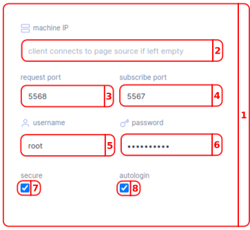
Client connection settings
button open and collapse Client connection settings menu.
- In the Client Connection Settings menu you can set up the connection with your controller.
- In the Ip address bar you have to fill in your motorcortex controllers local IP. (default
192.168.2.100). - In the request bar you fill in your Request/Reply channel port number by default this value is
5568. - In the Receive bar you fill in your Publish/Subscribe channel port number by default this value is
5567. - In the
usernamebar you fill in your username by default this isroot. - In the
passwordbar you fill in your password by default this isvectioneer. - With the
securecheckbox you can realize a secure connection. - With the
autologincheckbox you make the controller automatically re-login every time you connect.
Pressing
Errors
button will open and collapse Errors menu.
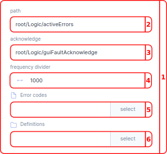
- In the Errors menu you can manage the visualization of your errors. These settings are used in the Error handler located in the Grid.
- In the
pathbar you select the path in the parameter tree to your error handler parameter. Per default this parameter isroot/Logic/activeErrors. - In the
acknowledgebar you can select the path in the parameter tree to your acknowledge parameter. Per default this parameter isroot/Logic/guiFaultAcknowledge. - With the
frequency divideryou can reduce the rate at which the server publishes its data. The server update rate is divided by this value; e.g. if the server has an update rate of 1000 Hz, a frequency divider of 100 will make the publisher send only every 100th sample, resulting in an update rate of the received data of 10 Hz. - In the
Error codesbar you can select the.jsonfile with your error codes. - In the
Definitionsbar you can select thefoldercontaining the error definitions.
Error Codes
The Error Parameter provides a Error number. This number can be linked to a file .json file created by the user to show text. Below is a template that gives an example of a errors.json file:
{
  "0": "SYSTEM_OK",
  "100": "WA_SYSTEM_WARNING",
  "101": "WA_REALTIME_VIOLATION",
  "500": "ES_SYSTEM_ERROR",
  "700": "SD_SYSTEM_ERROR",
}
Error Definitions
It is also possible to give definitions to errors. This can be done by putting .html files in the selected Errors folder. a template for the .html files inside this folder is given below:
{
<h1>100: Warning System Warning</h1>

<h2>Description</h2>
<p>Generic System Level Warning (used only for debug purposes)</p>
<!--
<h2>Cause</h2>
<ol>
<li>To Be Determined</li>
</ol>

<h2>Remedy</h2>
<ol>
<li>To Be Determined</li>
</ol>
-->
}
It is recommended to also put a default.html file inside the Errors folder for debugging purposes:
{
<h1>No error description available.</h1>
<p>Please consult the troubleshooting manual for more information.</p>
}
Pressing
States
button will open and collapse States menu.
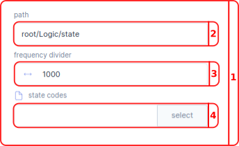
- In the States menu you can manage the visualization of your system states.
- In the
pathbar you select the path in the parameter tree to your state parameter. Per default this parameter isroot/Logic/state. - With the
frequency divideryou can reduce the rate at which the server publishes its data. The server update rate is divided by this value; e.g. if the server has an update rate of 1000 Hz, a frequency divider of 100 will make the publisher send only every 100th sample, resulting in an update rate of the received data of 10 Hz. - In the
state codesbar you place the.jsonfile with your state codes.
State Codes
The state parameter provides a state number. This number can be linked to a .json file, created by the user to show text. Below is a template that gives an example of a states.json file:
{
  "0": "INIT_S",
  "1": "OFF_S",
  "2": "DISENGAGED_S",
  "4": "ENGAGED_S",
  "7": "ESTOP_OFF_S",
}
Pressing
Logs
button will open and collapse Logs menu.
- In the Log menu you keeps track of what is going on in the system and can be used for debugging purposes.
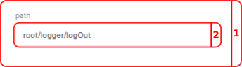
- In the
Pathbar you select the path in the parameter tree to your log parameter. Per default this parameter isroot/Logic/logOut.
Pressing
Screen
button will open and collapse Screen menu.
- In the Screen menu you can manage the visualization of your screens, a GUI can have multiple screens.
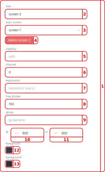
- In the
titlebar you can change the title of your screen. - In the
start screendropdown you can choose the default start screen. - With the
deletebutton you can delete the selected screen. A message will make you confirm deletion. - In the
visibilitybar you can select the Parameter in the Parameter tree that will make your screen show up. Per default no path screen selected, meaning always make a screen show up. It is not possible to change visibility for the start screen. - In the
channelbar you can select the channel of the selected path. - With the
expressionyou can manipulate the presentation of the output. For example convert Meters to Inches. The raw parameter is calledx. - With the
frequency divideryou can reduce the rate at which the server publishes its data. The server update rate is divided by this value; e.g. if the server has an update rate of 1000 Hz, a frequency divider of 100 will make the publisher send only every 100th sample, resulting in an update rate of the received data of 10 Hz. - With a
groupyou can specify a group of parameters used for this screen. - In the
Wbar you can define the width of all screens. The default value for thewidthis800. - In the
Hbar you can define the height of all screens. The default value for theheightis600. - In the
foreground color boxyou can select the color you want for the foreground of your grid inhexvalue. The default hex color value is#323c4e. - In the
background color boxyou can select the color you want for the background of your grid inhexvalue. The default hex color value is#28303e.
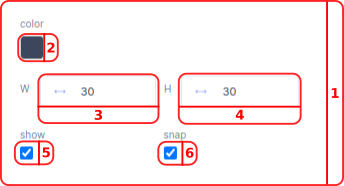
Pressing
Raster
button will open and collapse Raster menu.
- In the Raster menu you can manage the visualization of your raster to aid in placing components.
- In the
color boxyou can select the color you want for the Raster of your grid inhexvalue. The default hex color value is#3c475d. The raster is only applied in edit mode and does not show up in preview mode. - In the
Wbar you can define the width of the raster. The default value for the width is30. - In the
Hbar you can define the height of the raster. The default value for the height is30. - With the
showcheckbox you can make the raster visual. - With the
snapcheckbox you can make the components inside the grid snap to the raster.