Widget library
22 minute read
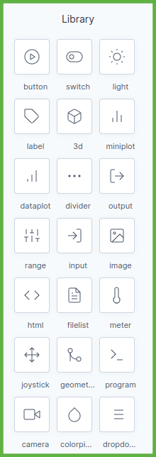
The widget library on the left of the Grid editor holds the widgets you place on a screen: buttons and sliders that write to the controller, outputs and plots that show its values, and widgets that arrange the screen. The Library tab shows them all and the properties every widget shares; each other tab covers one widget.
Warning
With Grid you can read and change every parameter of the running control system. Changing a parameter can make the machine behave unpredictably or unstably, damage it or its surroundings, or put people in danger. Only system experts who know what a parameter change does should use the tool.
Input widgets write a value to a parameter of the controller, output widgets show one, and the rest arrange the screen or manage files and motion programs. Click a widget to open its tab.
In the editor the library sits on the left. Select a widget on a screen to show its properties in the properties panel on the right.
How a widget uses a parameter
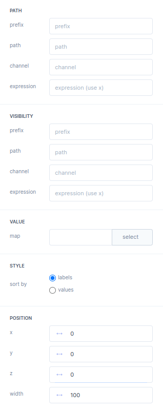
Most widgets are linked to a parameter through a PATH group, and every widget has a VISIBILITY group that decides when it is on screen. Both work the same way: the prefix and path name the parameter, the channel picks one element of an array, and the expression turns the raw value x into what the widget uses.
Properties every widget has
The tables on the widget tabs leave these groups out. In the .grid file each property is stored under the key given in brackets.
| Property | What it does | Default |
|---|---|---|
| PATH | The parameter the widget shows or writes. Widgets that link to more than one parameter have a group per parameter, such as PATH 1 to PATH 6 or PATH HORIZONTAL. | |
prefix (prefix) |
Goes in front of path, with a / between them. Give widgets that use the same part of the tree the same prefix, and each its own short path. |
empty |
path (path) |
The parameter in the parameter tree. | empty |
channel (slot) |
The element of an array parameter, counted from 0. |
empty |
expression |
Turns the raw value, called x, into what the widget shows, for example x*180/3.14159 from radians to degrees. Not every PATH group has it. |
empty |
VISIBILITY (visibility) |
When the widget is on screen. Without a path the widget is always shown. | |
prefix, path, channel |
The parameter that decides, as in PATH. | empty |
expression |
The widget is shown while the expression is true, for example x==3. Combine conditions with & and |, not && and ||. |
empty |
| POSITION | Where the widget sits and how large it is. | |
x, y (x, y) |
The position of the widget on the screen. | where you place it |
z (z) |
Which widget lies on top when two overlap: the higher one. 0 to 1000. |
0 |
width, height |
The size of the widget. Some widgets have only a width, a single size, or a radius; the widget tab lists the default. |
per widget |
Put buttons, inputs and other widgets you click on a higher z than an image or divider behind them, so that the widget in front receives the click.
A few widgets subscribe to their parameters with a frequency dividerThe server update rate is divided by this value. With a server rate of 1000 Hz and a frequency divider of 100, the widget receives every 100th sample: 10 updates per second. , to keep the load on the network and the browser low.
The Default column on every tab is the value a new widget starts with, as the editor’s properties panel shows it; “empty” means the field starts blank. Where the column is blank, the default is not documented.
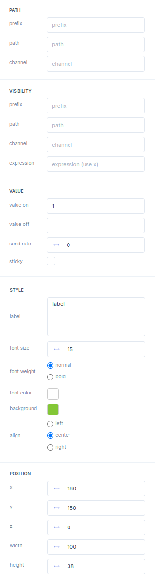
A button writes value on to its parameter when you press it and value off when you release it. Use it for commands such as Engage or Save.

Button properties
| Property | What it does | Default |
|---|---|---|
| PATH | The parameter the button writes to: prefix, path, channel, as on the Library tab. |
|
| VISIBILITY | When the widget is on screen, as on the Library tab. | |
| VALUE | ||
value on (valueOn) |
Sent when you press the button. Any number, so a button can also write a decimal value. | 1 |
value off (valueOff) |
Sent when you release the button. | empty |
send rate (sendingRate) |
How many times per second the button sends its value. | 0 |
sticky (sticky) |
The button can only be used while the parameter does not change. Use it for an action that must reply before you press again. | off |
| STYLE | ||
label (label) |
The text on the button. | label |
font size (fontSize) |
The size of the text. | 15 |
font weight (fontWeight) |
normal or bold. |
normal |
font color (color) |
The colour of the text. | #ffffff |
background (backgroundColor) |
The colour of the button. | #83c736 |
align (align) |
The text position: left, center or right. |
center |
| POSITION | x, y and z as on the Library tab, plus: |
|
width, height |
The size of the button. | 100, 38 |
The properties panel in the editor
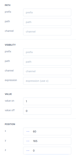
A switch toggles its parameter between value on and value off, and stays in the position you leave it in.

Switch properties
| Property | What it does | Default |
|---|---|---|
| PATH | The parameter the switch writes to: prefix, path, channel, as on the Library tab. |
|
| VISIBILITY | When the widget is on screen, as on the Library tab. | |
| VALUE | ||
value on (valueOn) |
Written when you switch it on. | 1 |
value off (valueOff) |
Written when you switch it off. | 0 |
| POSITION | x, y and z only, as on the Library tab. |
The properties panel in the editor
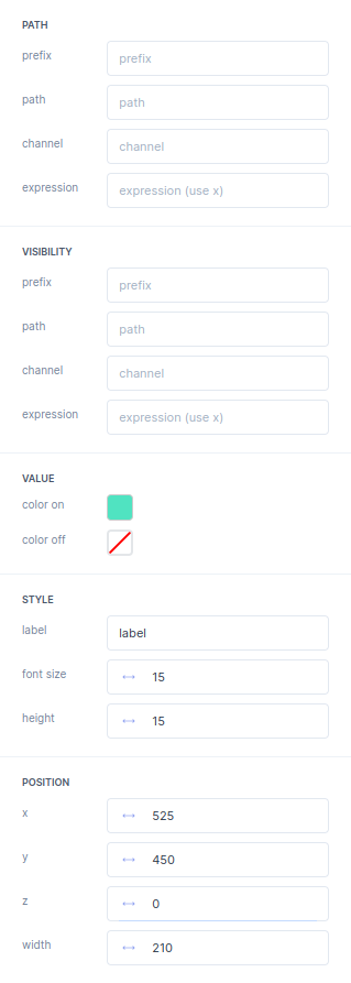
A light shows the state of its parameter in color on or color off. With an expression it can show one bit of a status word: (x & 8)/8 on root/DriveLogic/driveStatusWord gives 1 when bit 3 is set.

Light properties
| Property | What it does | Default |
|---|---|---|
| PATH | The parameter the light shows: prefix, path, channel and expression, as on the Library tab. |
|
| VISIBILITY | When the widget is on screen, as on the Library tab. | |
| VALUE | ||
color on (colorOn) |
The colour when the light is on. | #50e3c1 |
color off (colorOff) |
The colour when the light is off. | transparent |
| STYLE | ||
label (label) |
The text next to the light. | label |
font size (fontSize) |
The size of the text. | 15 |
height (lineHeight) |
The height of the light. | 15 |
| POSITION | x, y and z as on the Library tab, plus: |
|
width |
The width of the widget, light and text together. |
The properties panel in the editor
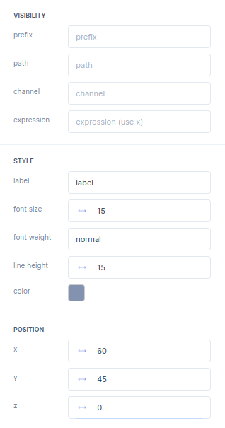
A label shows fixed text, such as a caption next to an output or a title above a group of widgets. It is not linked to a parameter.

Label properties
| Property | What it does | Default |
|---|---|---|
| VISIBILITY | When the widget is on screen, as on the Library tab. | |
| STYLE | ||
label (label) |
The text. | label |
font size (fontSize) |
The size of the text. | 15 |
font weight (fontWeight) |
normal or bold. |
normal |
line height (lineHeight) |
The height of a line of text. | 15 |
color (color) |
The colour of the text. | #8392af |
| POSITION | x, y and z only, as on the Library tab. |
The properties panel in the editor
The 3D widget shows a 3D model of your robot or machine and moves its parts with live parameters. How you build the model and its JSON file is described in 3D models.
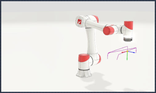
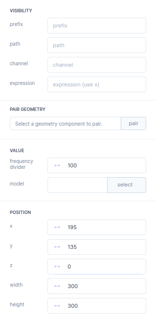
3D properties
| Property | What it does | Default |
|---|---|---|
| VISIBILITY | When the widget is on screen, as on the Library tab. | |
PAIR GEOMETRY (geometryID) |
Shows the teach points of a geometry widget in this 3D view. Click pair, then the geometry panel; the field then reads “Geometry component paired.” | not paired |
| VALUE | ||
frequency divider (frequencyDivider) |
Divides the update rate of the model parameters (see the Library tab). | 100 |
model (model) |
The model JSON file, chosen with select from the 3d folder of your GRID package, for example 3d/robot.json. |
empty |
| POSITION | x, y and z as on the Library tab, plus: |
|
width, height |
The size of the 3D view. | 300, 300 |
The properties panel in the editor
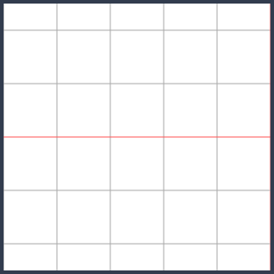
A miniplot draws up to six parameters as live lines over a short time window. Each line has its own PATH group with a colour.
Miniplot properties
| Property | What it does | Default |
|---|---|---|
| VISIBILITY | When the widget is on screen, as on the Library tab. | |
PATH 1 to PATH 6 (path0 to path5) |
One line each: prefix, path, channel and expression as on the Library tab, plus: |
|
color (color) |
The colour of the line. | PATH 1 to 6: #424956, #F73022, #ECD32F, #50e3c1, #ee8a56, #83c736 |
| VALUE | ||
frequency divider (frequencyDivider) |
Divides the update rate of the plotted parameters (see the Library tab). | 100 |
time range (timerange) |
The time span the plot shows. | 1 |
y min (ymin) |
The bottom of the y axis. | -1 |
y max (ymax) |
The top of the y axis. | 1 |
| POSITION | x, y and z as on the Library tab, plus: |
|
width, height |
The size of the plot. | 300, 300 |
The properties panel in the editor

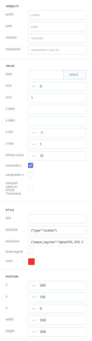
A dataplot plots the columns of a .csv or .json file, for example a log, and reloads the file at a set interval. It draws with
Plotly, so its style and layout take Plotly options.

Dataplot properties
| Property | What it does | Default |
|---|---|---|
| VISIBILITY | When the widget is on screen, as on the Library tab. | |
| VALUE | ||
data |
The .csv or .json file, chosen with select. |
empty |
xcol |
The index of the column for the x axis, for example 0. |
0 |
ycol |
The index of the column for the y axis, or a list of indices such as [1,2,3]. |
1 |
x label, y label |
The axis titles. | empty |
y min, y max |
The range of the y axis. | -1, 1 |
refresh every |
How often the plot reloads the file. | 10 |
autoscale y |
Scales the y axis to the data. | on |
rangeslider x |
Shows a range slider under the x axis. | off |
Interpret value as POSIX Timestamp |
Reads the x values as POSIX timestamps. | off |
| STYLE | ||
title |
The title of the plot. | empty |
plotstyle |
Plotly trace options as JSON; see the Plotly reference. | {"type":"scatter"} |
plotlayout |
Plotly layout options as JSON; see the Plotly layout reference. | a layout with paper_bgcolor set |
show legend |
Shows the legend. | off |
color |
The colour of the line. | red |
| POSITION | x, y and z as on the Library tab, plus: |
|
width, height |
The size of the plot. | 300, 300 |
The properties panel in the editor
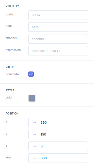
A divider draws a horizontal or vertical line to separate parts of a screen.

Divider properties
| Property | What it does | Default |
|---|---|---|
| VISIBILITY | When the widget is on screen, as on the Library tab. | |
| VALUE | ||
horizontal (horizontal) |
On: a horizontal line. Off: a vertical line. | on |
| STYLE | ||
color (color) |
The colour of the line. | #8392af |
| POSITION | x, y and z as on the Library tab, plus: |
|
size (width) |
The length of the line. | 300 |
The properties panel in the editor
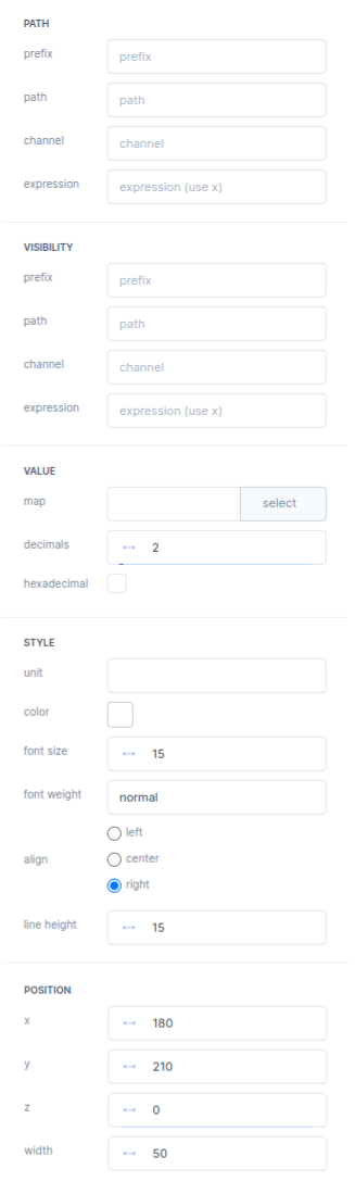
An output shows the value of a parameter as a number, or as text from a map file, for example an error name instead of an error code.

Output properties
| Property | What it does | Default |
|---|---|---|
| PATH | The parameter the output shows: prefix, path, channel and expression, as on the Library tab. |
|
| VISIBILITY | When the widget is on screen, as on the Library tab. | |
| VALUE | ||
map (map) |
A .json file, chosen with select, that gives a text per value. See Mapping values to text or images. |
empty |
decimals (decimals) |
The number of decimals shown. | 2 |
hexadecimal (toHex) |
Shows the value as a hexadecimal number. | off |
| STYLE | ||
unit (unit) |
The unit shown after the value. | empty |
color (color) |
The colour of the text. | #ffffff |
font size (fontSize) |
The size of the text. | 15 |
font weight (fontWeight) |
normal or bold. |
normal |
align (align) |
The text position: left, center or right. |
right |
line height (lineHeight) |
The height of the output box. | 15 |
| POSITION | x, y and z as on the Library tab, plus: |
|
width |
The width of the output box. | 50 |
The properties panel in the editor
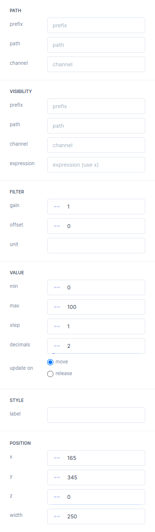
A range is a slider that writes a value between min and max to its parameter, while you move it or when you let go.

Range properties
| Property | What it does | Default |
|---|---|---|
| PATH | The parameter the slider writes to: prefix, path, channel, as on the Library tab. |
|
| VISIBILITY | When the widget is on screen, as on the Library tab. | |
FILTER (filter) |
||
gain |
A gain for the slider value. | 1 |
offset |
An offset for the slider value. | 0 |
unit |
The unit shown with the value. | empty |
| VALUE | ||
min (min) |
The lowest value you can select. | 0 |
max (max) |
The highest value you can select. | 100 |
step (step) |
The step size of the slider. | 1 |
decimals (decimals) |
The number of decimals shown. | 2 |
update on (updateOn) |
move: write the value while you move the slider. release: write it when you let go. |
move |
| STYLE | ||
label (label) |
The name shown with the slider. | empty |
| POSITION | x, y and z as on the Library tab, plus: |
|
width |
The length of the slider. | 250 |
The properties panel in the editor
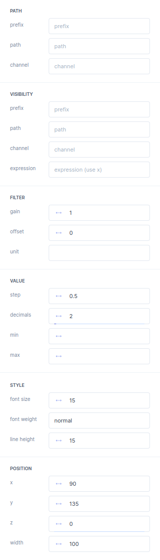
An input is a field in which you type a number. The widget writes it to its parameter.

Input properties
| Property | What it does | Default |
|---|---|---|
| PATH | The parameter the input writes to: prefix, path, channel, as on the Library tab. |
|
| VISIBILITY | When the widget is on screen, as on the Library tab. | |
FILTER (filter) |
||
gain |
A gain for the value you type. | 1 |
offset |
An offset for the value you type. | 0 |
unit |
The unit shown in the field. | empty |
| VALUE | ||
step (step) |
The step size of the value. | 0.5 |
decimals (decimals) |
The number of decimals shown. | 2 |
min (min) |
The lowest value you can enter. | empty |
max (max) |
The highest value you can enter. | empty |
| STYLE | ||
font size (fontSize) |
The size of the text. | 15 |
font weight (fontWeight) |
normal or bold. |
normal |
line height (lineHeight) |
The height of the input box. | 15 |
| POSITION | x, y and z as on the Library tab, plus: |
|
width |
The width of the input box. | 100 |
The properties panel in the editor
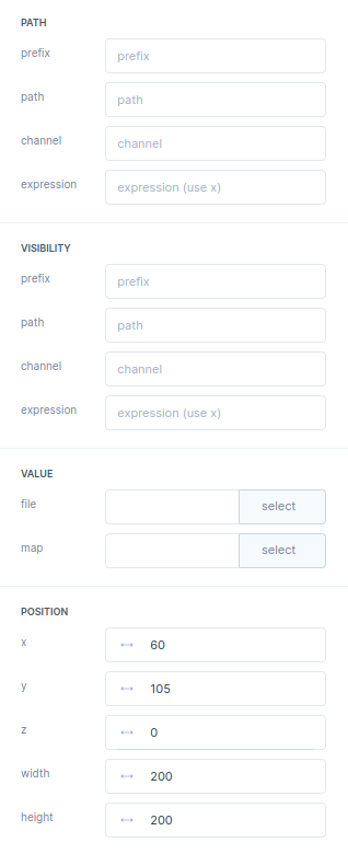
An image shows a picture from your GRID package, such as a logo. With a path and a map, it shows a different picture for each value of the parameter.

Image properties
| Property | What it does | Default |
|---|---|---|
| PATH | Optional. The parameter that picks the picture from the map: prefix, path, channel and expression, as on the Library tab. |
|
| VISIBILITY | When the widget is on screen, as on the Library tab. | |
| VALUE | ||
file (fileName) |
The picture, chosen with select, for example img/logo.svg. |
empty |
map |
A map file, chosen with select, that gives a picture per value. See Mapping values to text or images. | empty |
opacity (opacity) |
How opaque the picture is, from 0 to 1. The screenshot of the properties panel does not show this field yet. |
1 |
| POSITION | x, y and z as on the Library tab, plus: |
|
width, height |
The size of the picture. | 200, 200 |
The properties panel in the editor
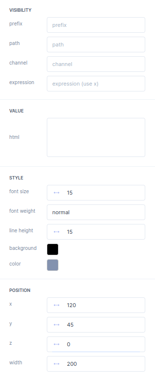
An HTML widget shows a block of text written in HTML, such as a warning or a link to another page.

HTML properties
| Property | What it does | Default |
|---|---|---|
| VISIBILITY | When the widget is on screen, as on the Library tab. | |
| VALUE | ||
html (html) |
The HTML to show, for example <p>Changing these parameters moves the robot.</p>. |
empty |
| STYLE | ||
font size (fontSize) |
The size of the text. | 15 |
font weight (fontWeight) |
normal or bold. |
normal |
line height (lineHeight) |
The height of a line of text. | 15 |
background (backgroundColor) |
The background colour of the block. | |
color (color) |
The colour of the text. | |
| POSITION | x, y and z as on the Library tab, plus: |
|
width |
The width of the block. | 200 |
The properties panel in the editor
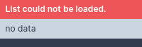
A file list shows the files in a folder that the web server of the controller shares, such as the log folder.
File list properties
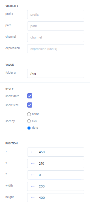
| Property | What it does | Default |
|---|---|---|
| VISIBILITY | When the widget is on screen, as on the Library tab. | |
| VALUE | ||
folder url (folderurl) |
The URL of the folder on the controller. The web server must list it as JSON; see below. | /log |
| STYLE | ||
show date (showDate) |
Shows the date of each file. | on |
show size (showSize) |
Shows the size of each file. With autoindex_exact_size off; in the web server configuration, sizes are shown in short form, such as 1.2 Mb. |
on |
sort by (sortBy) |
Sorts the list by name, size or date. |
date |
| POSITION | x, y and z as on the Library tab, plus: |
|
width, height |
The size of the list. | 200, 400 |
The properties panel in the editor
Share another folder with the file list
The web server on the controller (nginx) already shares the log folder /var/www/motorcortex/log at /log, as a JSON list. To show another folder, add a location for it in the same way.
-
Create the folder under
/var/www/motorcortex, for example/var/www/motorcortex/reports. -
Open the server configuration:
sudo nano /etc/nginx/mcx/sites-available/mcx-service.conf -
Copy the
/loglocation and change the folder name. This is the/loglocation as MCX-RTOS ships it:## log location /log { autoindex on; autoindex_format json; location /log/browse { alias $mcx_root/log; autoindex_format html; } } -
Reload nginx to apply the change:
sudo systemctl reload nginx -
Set
folder urlto the new location, for example/reports.
A meter shows the value of a parameter as a bar against coloured zones. The zones start at seven breaks, MIN, BREAK 1 to BREAK 5 and MAX, and each break is a fixed value or the value of another parameter.

Meter properties
| Property | What it does | Default |
|---|---|---|
| PATH | The parameter the meter shows: prefix, path, channel and expression, as on the Library tab. |
|
| VISIBILITY | When the widget is on screen, as on the Library tab. | |
MIN, BREAK 1 to BREAK 5, MAX (break0 to break6) |
The seven breaks, from low to high. Each has: | |
input (inputType) |
static value: the break is at value. path: the break follows a parameter, set with a path. |
static value |
value |
Where the break is. | MIN 0, BREAK 1 to 5 16, 32, 48, 64, 79, MAX 100 |
color (color) |
The colour of the zone that starts at this break. MAX has no colour. | red, orange, yellow, light green, green, blue |
show label |
Shows the value of the break on the scale. | off |
| VALUE | ||
unit (unit) |
The unit shown with the value. | empty |
decimals (decimals) |
The number of decimals shown. | 2 |
| STYLE | ||
orientation (orientation) |
horizontal or vertical. |
horizontal |
show value (showValue) |
Shows the value in the meter all the time. | on |
| POSITION | x, y and z as on the Library tab, plus: |
|
size (width) |
The length of the meter. | 400 |
The properties panel in the editor

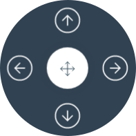
A joystick writes a value along one or two axes while you drag its knob, for example a jog velocity to root/Control/hostInJointVelocity. The arrows around it, the nudges, send a fixed value while you press them.
Joystick properties
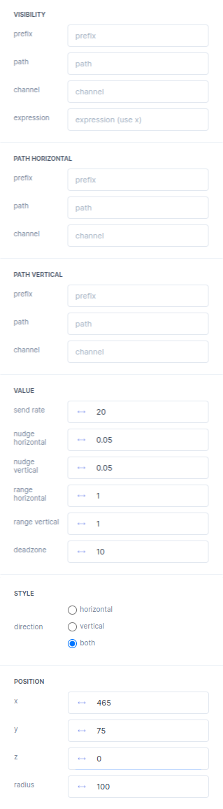
| Property | What it does | Default |
|---|---|---|
| VISIBILITY | When the widget is on screen, as on the Library tab. | |
PATH HORIZONTAL (pathHorizontal) |
The parameter for the horizontal axis: prefix, path and channel, as on the Library tab. |
|
PATH VERTICAL (pathVertical) |
The parameter for the vertical axis, in the same way. | |
| VALUE | ||
send rate (updateRate) |
How many times per second the joystick sends its values. | 20 |
nudge horizontal (nudgeAmountHorizontal) |
The value a horizontal arrow sends. | 0.05 |
nudge vertical (nudgeAmountVertical) |
The value a vertical arrow sends. | 0.05 |
range horizontal (rangeHorizontal) |
The range of the values the knob sends horizontally. | 1 |
range vertical (rangeVertical) |
The range of the values the knob sends vertically. | 1 |
deadzone (deadZone) |
The zone around the centre in which dragging the knob has no effect. | 10 |
| STYLE | ||
direction (direction) |
Which axes the joystick moves along: horizontal, vertical or both. |
both |
| POSITION | x, y and z as on the Library tab, plus: |
|
radius (radius) |
The size of the joystick. | 100 |
The properties panel in the editor
The geometry widget keeps a tree of teach points. Its Teach button stores the current position of the robot in a point, and its MoveTo button moves the robot to one. Pair it with a program widget to use the points in motion programs, and with a 3D widget to see them.
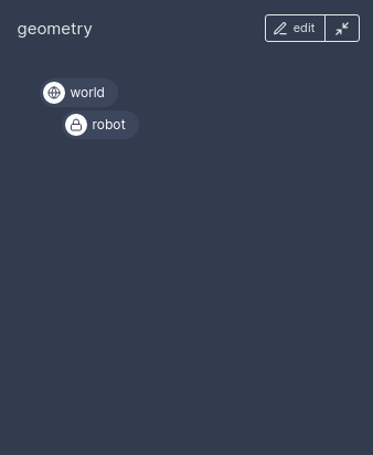
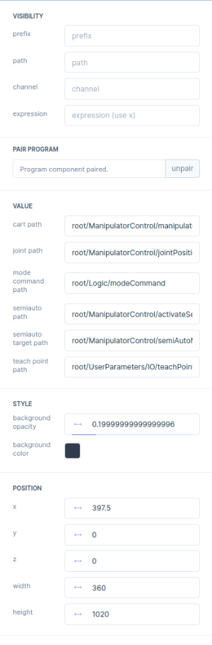
Geometry properties
| Property | What it does | Default |
|---|---|---|
| VISIBILITY | When the widget is on screen, as on the Library tab. | |
PAIR PROGRAM (programID) |
Links this widget to a program widget. Click pair, then the program panel; the field then reads “Program component paired.” | not paired |
| VALUE | The paths below are those of the standard robot application. | |
cart path (cartPath) |
The actual Cartesian tool pose, stored in a point by Teach: root/ManipulatorControl/manipulatorToolPoseActual. |
|
joint path (jointPath) |
The actual joint positions, stored in a point by Teach: root/ManipulatorControl/jointPositionsActual. |
|
mode command path (modePath) |
The mode command: root/Logic/modeCommand. |
|
semiauto path (semiAutoPath) |
Activates semi-auto mode: root/ManipulatorControl/activateSemiAuto. |
|
semiauto target path (semiAutoTargetPath) |
Where a MoveTo moves to: root/ManipulatorControl/semiAutoMotionGenerator/target. |
|
teach point path (teachPointPath) |
A trigger that teaches a point on its rising edge, usually a user parameter such as root/UserParameters/IO/teachPointTrigger. |
|
| STYLE | ||
background opacity (backgroundOpacity) |
From 0, no background, to 1, a solid background. |
0.2 |
background color (backgroundColor) |
The colour of the background. | #323c4e |
| POSITION | x, y and z as on the Library tab, plus: |
|
width, height |
The size of the panel. |
The properties panel in the editor
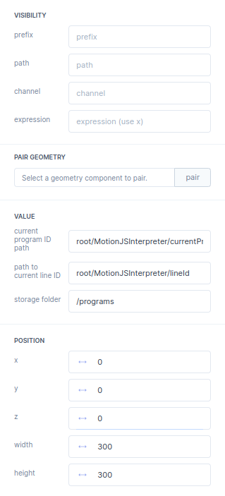
The program widget is where you write, save and run motion programs. Pair it with a geometry widget to use its teach points in your programs.
Program properties
| Property | What it does | Default |
|---|---|---|
| VISIBILITY | When the widget is on screen, as on the Library tab. | |
PAIR GEOMETRY (geometryID) |
Links this widget to a geometry widget. Click pair, then the geometry panel; the field then reads “Geometry component paired.” | not paired |
| VALUE | ||
current program ID path (currentProgramIdPath) |
The ID of the program the motion interpreter runs. | root/MotionJSInterpreter/currentProgramId |
path to current line ID (currentCommandIdPath) |
The line of the program the motion interpreter runs. | root/MotionJSInterpreter/lineId |
storage folder (storagePath) |
Where programs are stored, relative to the project. | /programs |
| POSITION | x, y and z as on the Library tab, plus: |
|
width, height |
The size of the panel. | 300, 300 |
The .grid file of a program widget also holds collisionPath and modePath, which the properties panel does not show.
The properties panel in the editor
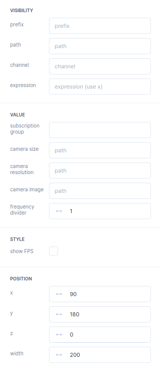
A camera widget shows a live camera image. The image, its size and its resolution come from parameters that your application publishes.

Camera properties
| Property | What it does | Default |
|---|---|---|
| VISIBILITY | When the widget is on screen, as on the Library tab. | |
| VALUE | ||
subscription group |
The subscription group for the camera parameters. | empty |
camera size |
The path of the parameter with the camera size. | empty |
camera resolution |
The path of the parameter with the camera resolution. | empty |
camera image |
The path of the parameter with the camera image. | empty |
frequency divider |
Divides the update rate of the camera parameters (see the Library tab). | 1 |
| STYLE | ||
show FPS |
Shows the number of frames per second in the image. | off |
| POSITION | x, y and z as on the Library tab, plus: |
|
width |
The width of the view. | 200 |
The properties panel in the editor
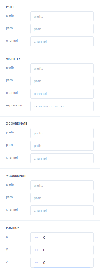
A colorpick widget shows a Pick color button. Besides its PATH it links to two more parameters, an X and a Y coordinate.

Colorpick properties
| Property | What it does | Default |
|---|---|---|
| PATH | The parameter of the colour: prefix, path, channel, as on the Library tab. |
|
| VISIBILITY | When the widget is on screen, as on the Library tab. | |
| X COORDINATE | A parameter for the X coordinate: prefix, path and channel, as on the Library tab. |
|
| Y COORDINATE | A parameter for the Y coordinate, in the same way. | |
| POSITION | x, y and z only, as on the Library tab. |
The properties panel in the editor
A dropdown lets you pick one entry from a map file and writes the value of that entry to its parameter, for example a homing mode.

Dropdown properties
| Property | What it does | Default |
|---|---|---|
| PATH | The parameter the dropdown writes to: prefix, path, channel and expression, as on the Library tab. |
|
| VISIBILITY | When the widget is on screen, as on the Library tab. | |
| VALUE | ||
map (map) |
The .json map file with the values and their labels, chosen with select. See Mapping values to text or images. |
empty |
| STYLE | ||
sort by (sortBy) |
Orders the entries by labels or by values. |
labels |
| POSITION | x, y and z as on the Library tab, plus: |
|
width |
The width of the field. | 100 |
The properties panel in the editor