Divider Tab
2 minute read
Will add a divider input widget to the grid. When a divider is selected the Inputbox on the right of the screen will start showing the divider properties.
| Bar | Description |
|---|---|
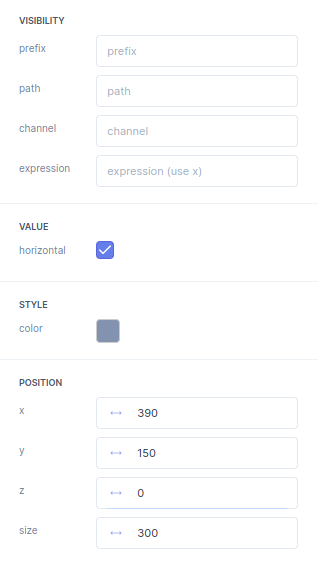
| VISIBILITY | In the Visibility bar you can select the Parameter in the Parameter tree that will make this your element show up. Per default no path will always make a element show up. |
prefix |
In the prefix you fill in the path of a parameter. A prefix is mainly useful for editing multiple paths of parameters. |
path |
This path manipulates the visibility of the element and can be selected from the parameter tree. |
channel |
If a selected parameter is a array you can select the desired channel of the array here. |
expression |
With the expression you can manipulate the presentation of the output. For example convert Meters to Inches. The raw parameter is called x. |
| VALUE | |
horizontal |
The horizontal
checkbox is used to make the divider horizontally aligned. |
| STYLE | |
color |
Here you determine the color
of your divider line. |
| POSTION | |
x |
The x
position of a element is defined here. |
y |
The y
position of a element is defined here. |
z |
The z
position of a element is defined here. |
size |
the size
of a element is defined here. |
