Analysing
4 minute read
The Statistics panel reports numbers over a stretch of plotted data: how large a signal is, how much it moves, where its extremes fell. It works on whichever traces are selected in Active. From a card there you can also open the Spectrum panel, which shows the frequency content of one trace over the same range.
Both work on buffered data, so they apply equally to a live session and to a loaded replay.
Prerequisites
- At least one trace on the plot. See Plotting.
Measuring a stretch of signal
-
Select the traces you want in the Active panel. Statistics follows that selection, so a folder row gives you every channel of a parameter at once.
-
Click Select range, then drag across the plot to mark the stretch, or type exact values into From and To.
The band and the boxes are the same ones the CSV export uses, down to the click-the-plot time picker. See Exporting.
-
A card appears for each selected trace, recomputing about three times a second while the range or the data changes.
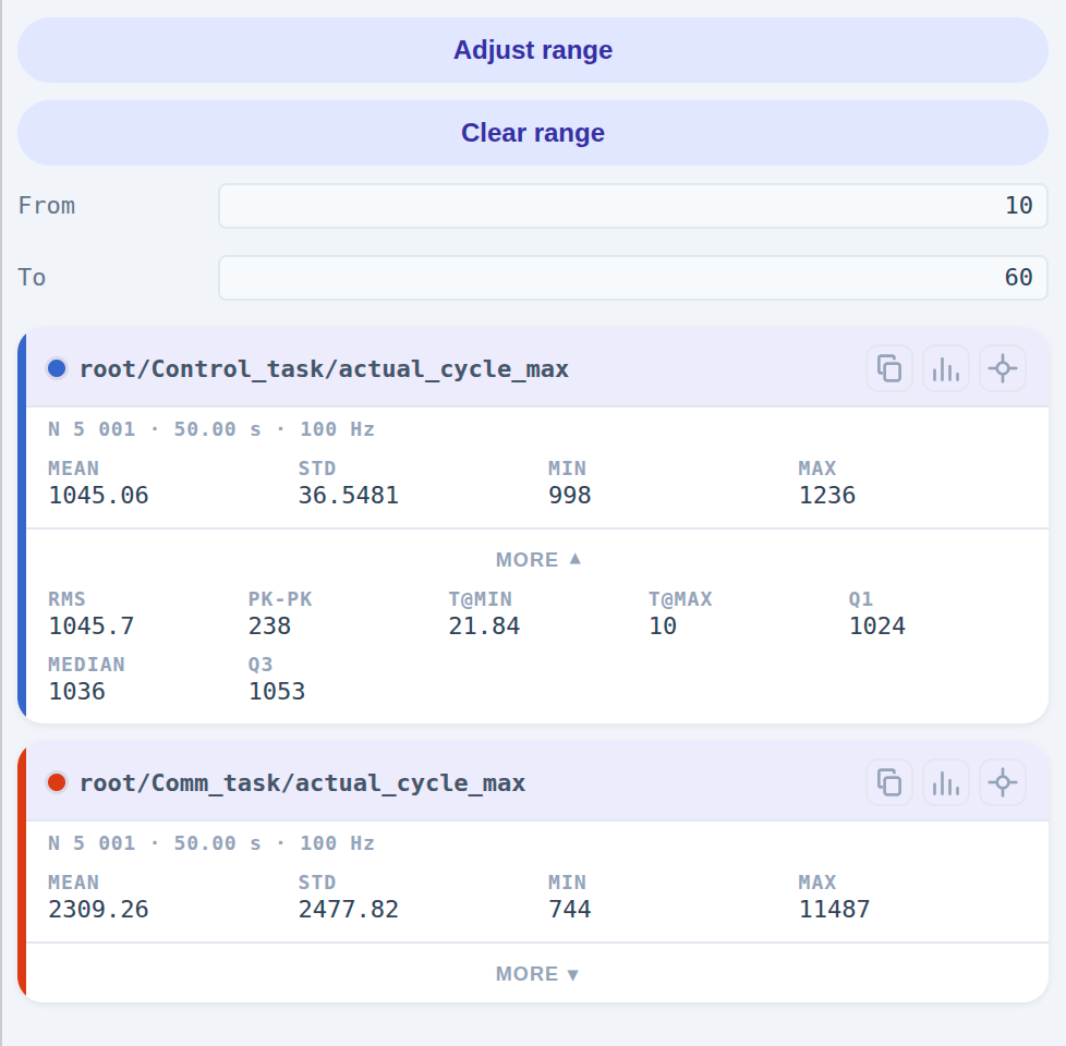
The two buttons above the boxes change with what you are doing:
| While | Left button | Right button |
|---|---|---|
| No range yet | Select range | hidden |
| Drawing one | Cancel | hidden |
| Range drawn, still editing | Clear range | Lock range |
| Range locked | Clear range | Adjust range |
Locking ends the editing session and leaves the range in force; Adjust range reopens it. Until both a selection and a range exist the panel says which one is missing rather than showing empty cards.
Reading a card
The header carries the trace’s full path in its own colour, and under it N, the span of data actually inside the
range, and the mean sample rate over it. That last one is worth a glance: it tells you whether the divider you are
subscribed at is fine enough for what you are measuring.
| Field | Meaning |
|---|---|
| Mean | Average value over the range |
| Std | Standard deviation: how much the values spread around the mean |
| Min, Max | Smallest and largest value in the range |
More reveals the rest:
| Field | Meaning |
|---|---|
| RMS | Root mean square |
| Pk-Pk | Peak-to-peak, Max − Min |
| t@Min, t@Max | Where along X each extreme fell |
| Q1, Median, Q3 | Quartiles: the 25th, 50th and 75th percentiles |
The quartiles cost a sort, so they are computed only while the More grid is open.
Each card carries three buttons: copy the figures to the clipboard, open the spectrum of this trace, and isolate it.
Isolating one trace
The isolate button hides every other trace and draws the isolated one against its own Min, Mean, Median and Max levels, with the Q1–Q3 band shaded behind it. It is the quickest way to see whether a signal sits where its statistics say it does. Press it again to show everything.
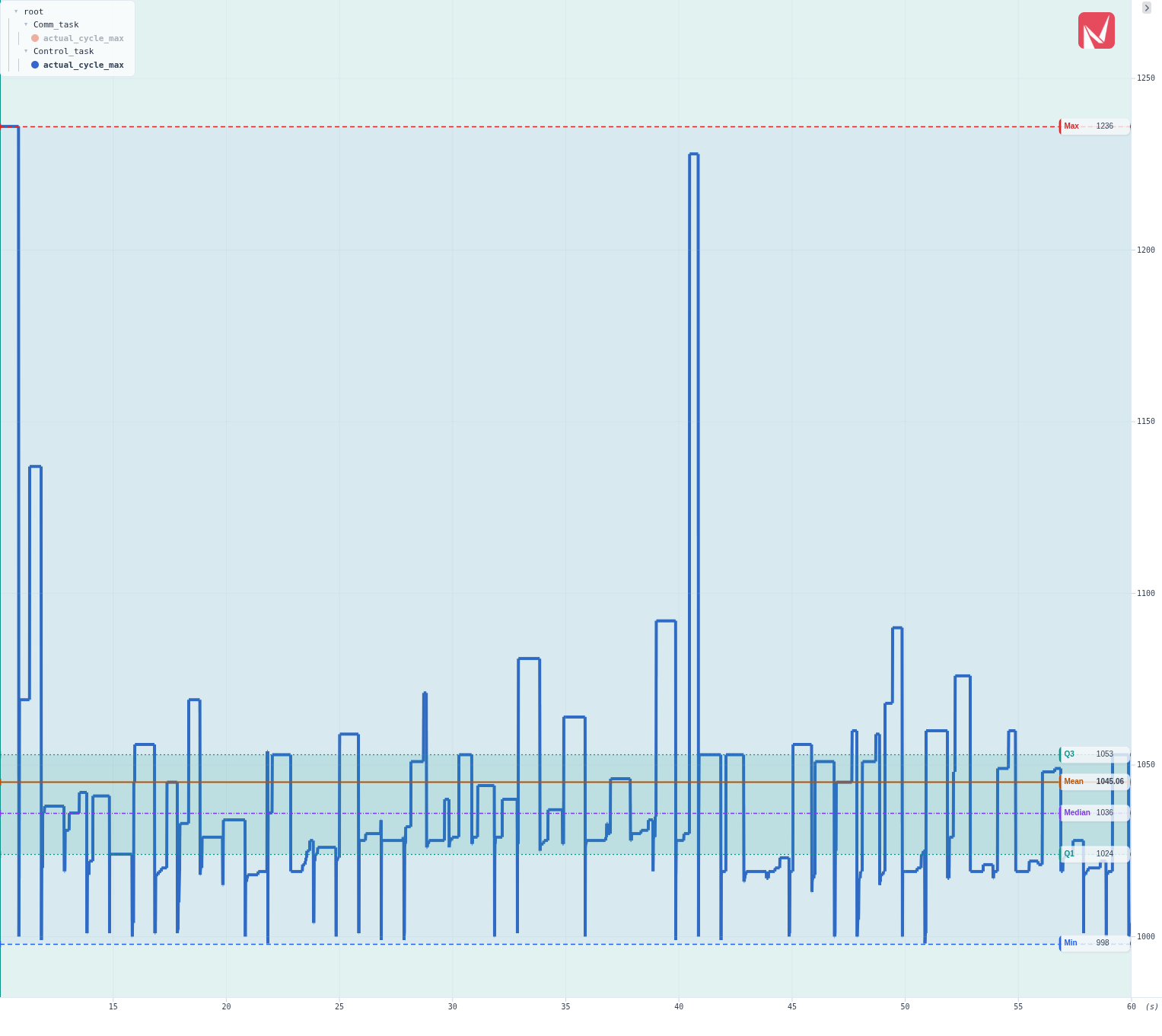
An isolated trace keeps its card even if you deselect it in Active, so the button never disappears while isolation is on.
Following the live edge
A range whose end sits at or past the newest data keeps up with the stream instead of staying put: the end jumps forward in look-ahead-sized steps as data reaches it. A window that ends inside existing data is historical and stays exactly where you put it.
The step size is the Look-ahead setting, so a larger value gives bigger, less frequent jumps. See Settings.
The frequency spectrum
The spectrum button on a card opens the Spectrum panel beside the plot and points it at that trace: an FFT magnitude in dB against a logarithmic frequency axis in Hz, recomputed on the same tick as the cards. It carries a one-entry legend naming the signal it is of.
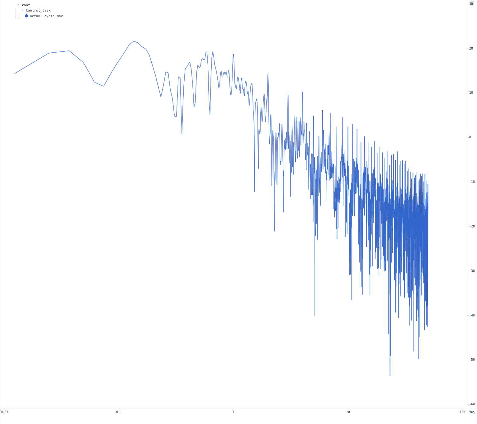
Before transforming, Desk resamples the range onto a uniform grid at the signal’s median sample interval, removes the mean, and applies a Hann window. The DC bin is not drawn, so the curve starts at the first real frequency rather than at the signal’s offset.
| Situation | What the panel does |
|---|---|
| A different trace is selected in Active | Re-points at it: new curve, new colour, new name |
| The trace stays selected and another is added | Keeps showing the first one |
| No selection, no range, or fewer than eight samples | Closes |
Only one trace drives it at a time, and its own right-click menu offers Reset view and Save as image….
Note
The spectrum is magnitude only. Desk does not draw a phase curve.
Read a peak against the sample rate on the card that opened it: a spectrum can only show frequencies up to half that rate, and a divider chosen for a light network load is often too coarse for the vibration you are chasing.