Navigating the plot
10 minute read
Most navigation happens with the mouse directly on the plot. The View panel holds the toggles you set once and forget.
Catching an event that just went past
Something happened, it has already scrolled by, and you want to read the numbers. This is the whole loop.
-
Press Ctrl+P to pause. The plot freezes; data keeps arriving in the background, so nothing is lost.
-
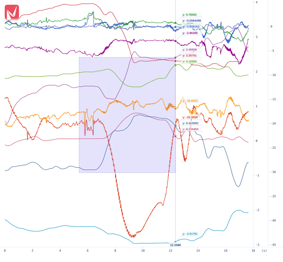
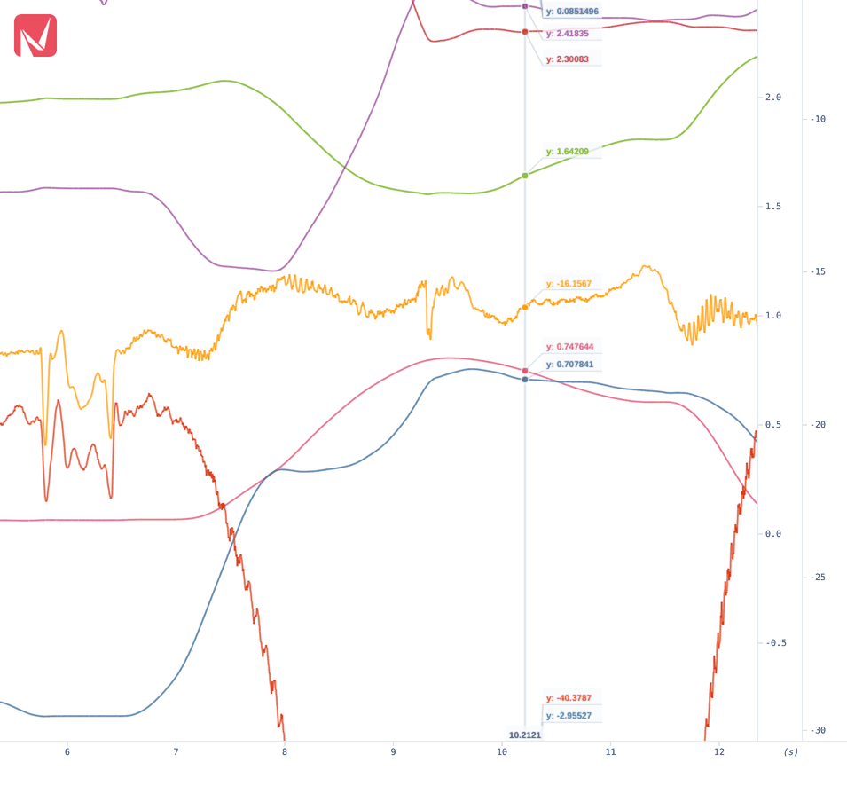
Drag a rectangle around the event. Nothing has to be armed first: a drag on the plot is zoom-to-area.
-
Move the pointer across the zoomed window. The cursor labels every visible trace with its value at that instant, in the trace’s own colour.
-
Press Ctrl+P again to resume, then Home to jump back to the live edge.
Pausing was optional (zooming would have switched auto-follow off by itself), but pausing first stops the picture moving while you aim.
For the difference between two points rather than the values at one, place a measurement instead. See Measuring.
Reference
Gestures is the one to read; the rest are toggles and menus.
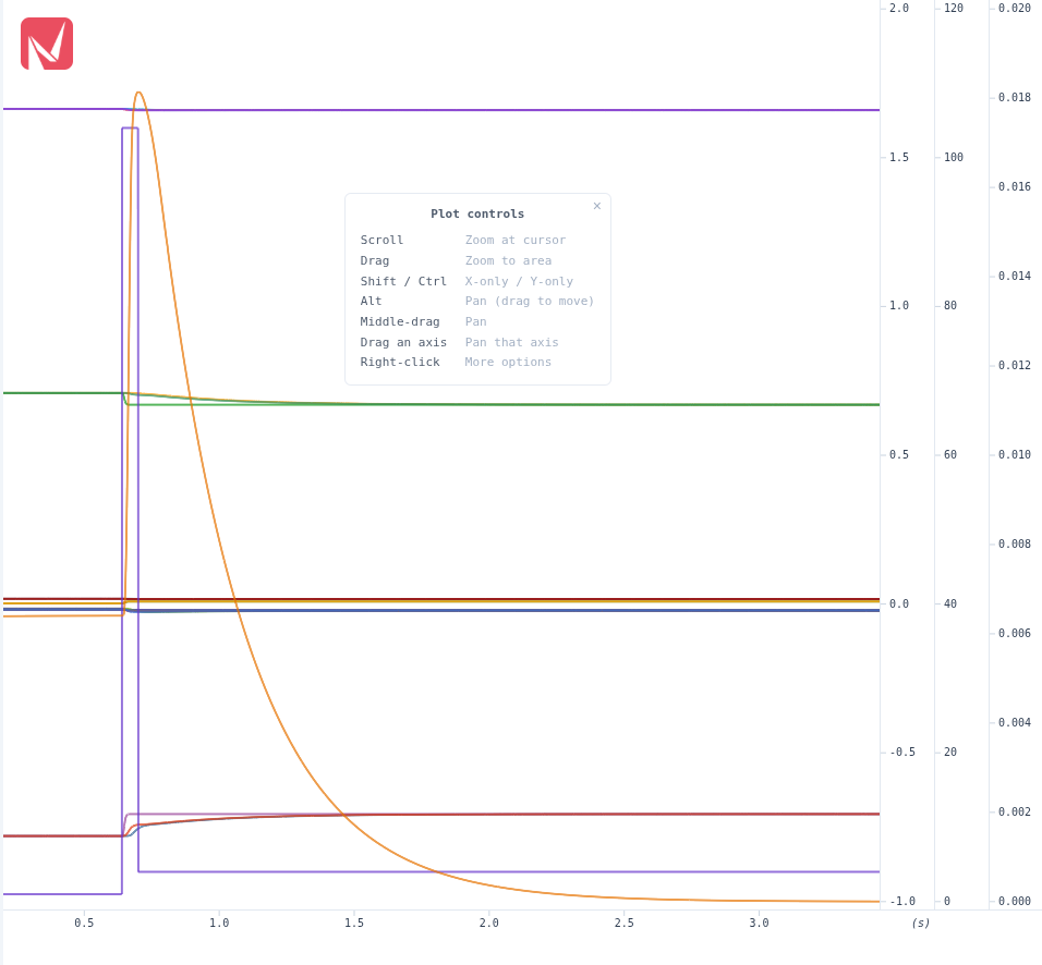
| Gesture | Effect |
|---|---|
| Scroll | Zoom in and out around the pointer |
| Drag | Zoom to the area you draw |
| Shift + scroll / drag | Zoom or pan the X axis only |
| Ctrl / Cmd + scroll / drag | Zoom or pan the Y axis only |
| Alt + drag | Pan both axes |
| Middle-drag | Pan |
| Drag an axis | Pan that axis alone |
| Right-click | Plot context menu |
Nothing has to be armed first. A press that moves less than five pixels stays a click and reaches the cursor and the measure tool; only a drag past that draws a zoom rectangle.
While a modifier key is held the plot switches to panning and shows a badge naming what the drag now does: X axis — drag to pan · scroll to zoom, the same for Y axis, or Pan — drag to move the view under Alt. Releasing the key returns to the previous mode.
The Plot controls card
The same list is available on the plot itself as a small card, so you do not have to come back here.
Drag it anywhere over the plot, or close it with its ×; bring it back from the context menu (Show plot controls). The choice is remembered. Shrinking the panel pulls a dragged card back inside the plot rather than leaving it off-screen, and it returns to where you put it when the panel grows again.
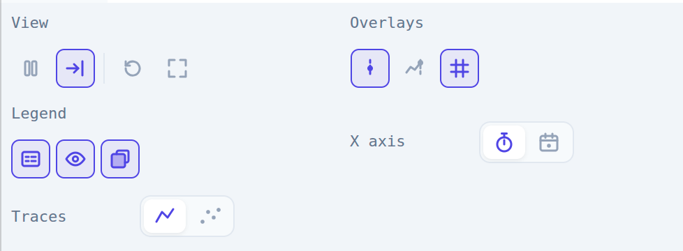
Five rows of icon buttons, grouped by what each one acts on. A button that is on is highlighted.
| Row | Buttons | Function |
|---|---|---|
| View | pause | Freeze the plot (Ctrl+P) |
| auto-follow | Keep the newest data in view. On by default | |
| ↺ | Reset the view to its default window (Ctrl+Z) | |
| ⛶ | View all data: frame every buffered sample of every trace | |
| Overlays | cursor | The cursor that follows the pointer. On by default |
| live cursor | Pin a cursor to the newest sample of every trace | |
| grid | Show grid lines | |
| Legend | legend | The legend overlay on the plot. On by default |
| show hidden | Give hidden traces a legend entry too. On by default | |
| background | Paint a solid card behind the legend | |
| X axis | stopwatch / calendar | Elapsed seconds, or the controller’s wall clock |
| Traces | line / dots | Draw traces as connected lines or as one dot per sample |
The legend buttons are covered in the Legend tab and the X-axis choice in Time base. The line/dot switch drives the size slider in Settings, which is where the width itself is set.
Everything here is remembered across sessions except the plot cursor, which starts on each time. The plot applies the remembered choices as it is created, so they survive a reload whether or not you ever open the View panel.
Auto-follow
With auto-follow on, the X axis scrolls to keep the latest samples visible, the normal mode during live acquisition.
A zoom or pan that carries the newest sample off the window horizontally switches it off automatically. A tall spike leaving the window vertically does not: that is a property of the signal, and Y auto-scale pulls it back on its own.
Re-enable it with the auto-follow button, the Home key, or Ctrl+A.
View all data
Frames every buffered sample of every trace, which is how you see a whole session after zooming into part of it. Unlike Reset view, it leaves auto-follow alone: the look-ahead gap keeps the newest sample inside the framed window.
Pausing
Pause (⏸ or Ctrl+P) freezes the plot while data keeps streaming in the background, which is how you read a moment that just went by without losing what comes next. Press it again to resume.
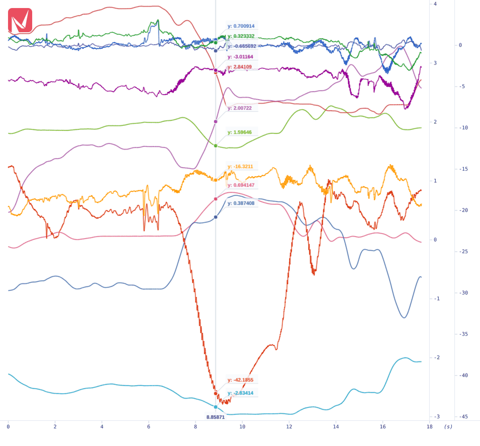
The cursor follows the pointer across the plot, marks where it crosses every visible trace, and labels each crossing with that trace’s Y value in the trace’s own colour. The X position is shown at the bottom of the cursor line.
That makes it the fastest way to read a set of signals at one instant: no clicking, no measurement to place.
The live cursor
A second cursor, pinned to the most recent sample of every trace rather than to the pointer, with the same value labels. It is drawn whether or not the pointer is over the plot, so the current values stay readable while you work in another panel.
It is suppressed in XY mode, where “most recent” has no position along the X axis, and switching the main cursor off hides it too.
For deltas between two points rather than values at one, use Measuring.
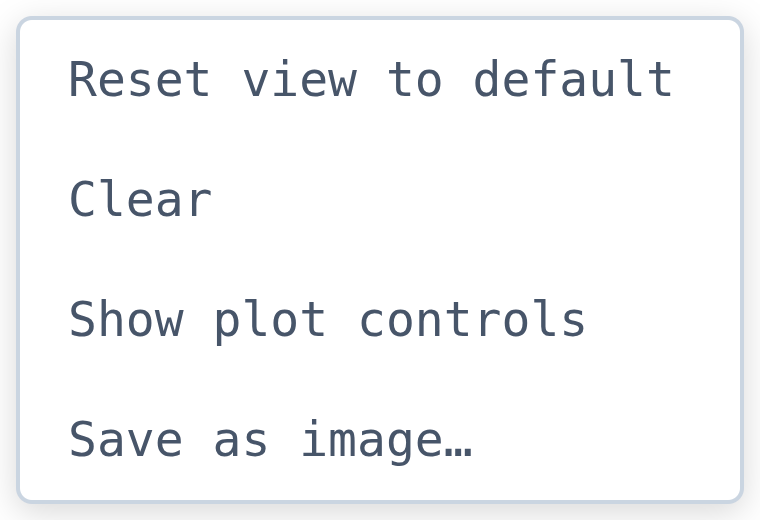
| Item | Action |
|---|---|
| Reset view to default | Reset the zoom and re-enable auto-follow |
| Clear | Empty the buffered points of all traces and start drawing fresh |
| Show / Hide plot controls | Toggle the gesture card |
| Save as image… | Write the plot to a PNG, JPEG or WebP file |
Clear throws away buffered history, so anything not yet exported is gone. It is for starting a fresh look at a signal, not for tidying the view. Reset view to default does that without losing data.
Right-clicking a row of the legend opens the legend’s menu instead. Right-clicking empty legend space reaches this one.
Resetting the zoom
Three routes, and they differ:
| Route | Effect |
|---|---|
| ↺ in the View panel, or Ctrl+Z | Return to the default window |
| Reset view to default in the context menu | The same, and re-enables auto-follow |
| ⛶ View all data in the View panel | Frame every buffered sample instead, leaving auto-follow alone |
Saving the plot as an image
Save as image… opens a dialog for the format (PNG, JPEG or WebP), the resolution (1×, 2× or 3× the size on screen) and whether the background is transparent. JPEG carries no alpha, so transparency is disabled for it.
There is no file-name field: the browser’s own Save dialog opens next, with a timestamped name such as
plot-2026-09-03_14-22-01 already suggested, and that is where the name and folder are chosen. The image is put on
the clipboard as well, as PNG whatever format was written, so it can be pasted straight into an issue or a
document.
The capture includes the traces, the axes, the grid and the legend as real text. Hidden traces are left out of the legend in the image, since they are not drawn in the plot either.
More plot room
Click the ⤢ button in the Plot tab, or press Ctrl+M, to maximize the plot over the whole workspace, and again to restore the layout. Each Y axis also carries a small chevron at its top that shrinks that axis to a sliver and hands its width to the plot, which is worth knowing once three or four axes are stacked beside a narrow panel. The traces on a collapsed axis keep drawing and keep auto-scaling; only its ticks and labels go.
Panels can also be popped out or closed entirely. See Workspace.